Nixplay Signage
How we created a new digital Signage platform, starting from a consumer product with +450k active users (Digital Cloud Photo Frames) from an existing Web App allowing Nixplay users to organize and share their content thru their digital photo frames, friends and families by using Nixplay Cloud services.
Now here is the story of how we created a dedicated platform and products made to fulfill the need of a growing part of our existing users who wanted to have more advanced use of our product and ultimately led to a completely new, full fletched Integrated Digital Signage line up.
Task at hand
First some context, we started with some technological limitations and had to use the same existing base to create a new sustainable B2b Signage Platform by optimizing engineering time and effort. First, we had to agree with the different Stakeholders on how to build a Minimal Viable Product with enough features to satisfy the needs of our existing users, and also be suitable for future improvements & new users.
Our task was to create a new product to adapt to the growing needs of Nixplay users, based on an existing product transformed to reach a new potential both in terms of Software & Hardware.
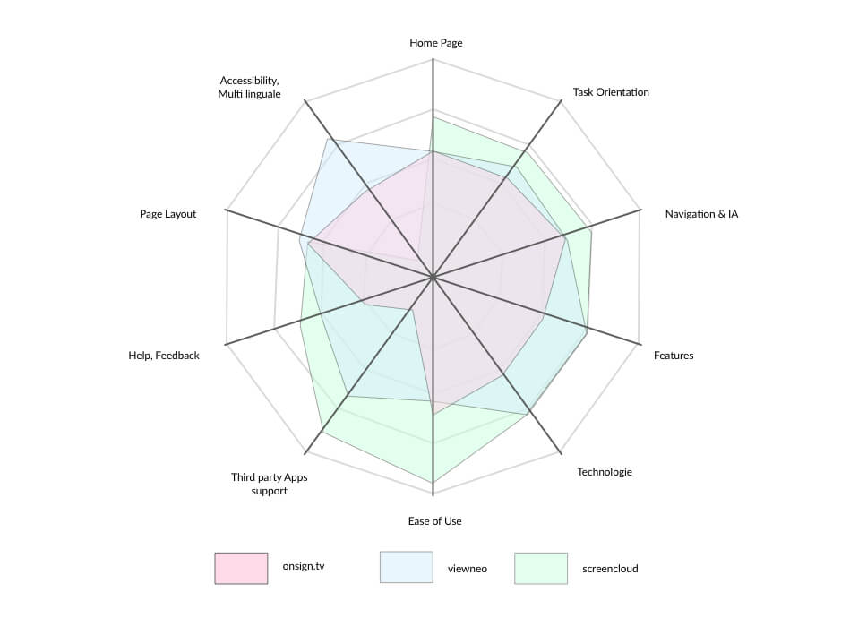
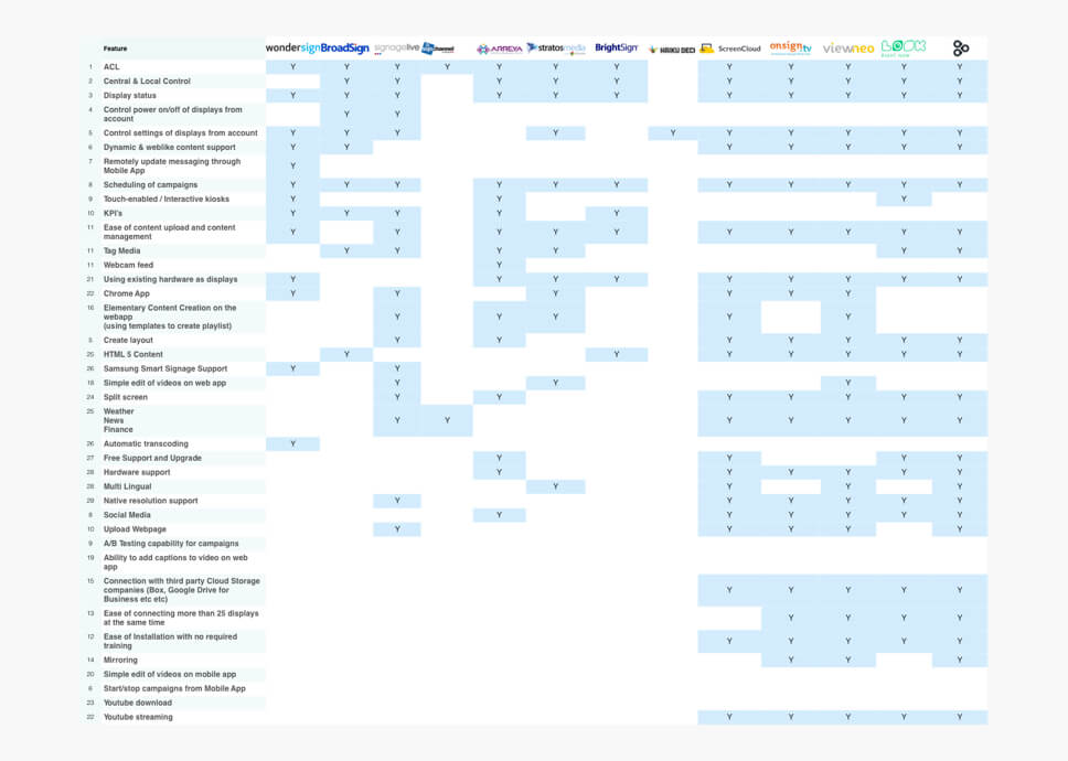
First some competitive researches
We started with an overarching competitive audit of what was happening in the Signage industry, from big players in the industry to medium/small businesses proposing simple Signage solutions.
Evaluating the strengths and weaknesses of our competitors, allowed us to define what kind of core features were represented in the Signage industry.
Take away: Top features we had to provide to compete in the B2b Signage industry. e.g. Central & local Displays control of settings & power, Display Monitoring Status, Schedule of campaigns, Layout creation, Multiple users access.
Then some understanding of the actual system
We basically did a complete review of the existing platform. Focusing on the features we knew were working well for our users, and sublimed them for this new product. We obviously fix or discarded what wasn’t optimal, to avoid carrying on existing flaws on the new platform.
This mapping got us on a good start with the knowledge of what type of features we should implement on top of our existing ones.
Take away: We knew that we would have to keep the existing content management organization as a base for the new product.
A closer look at
our advanced
users
our advanced
users
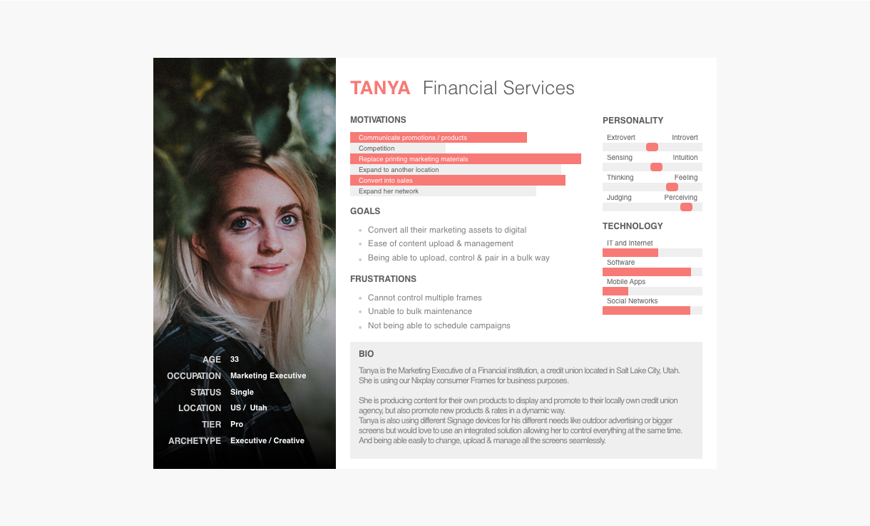
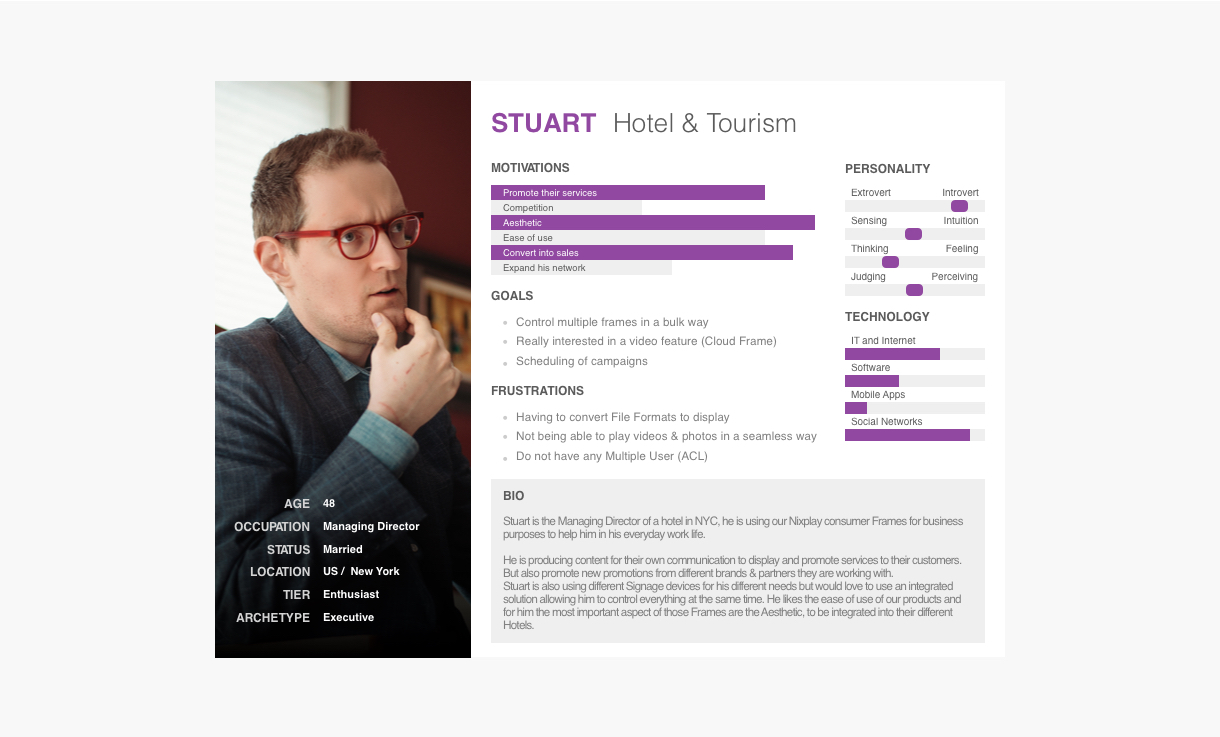
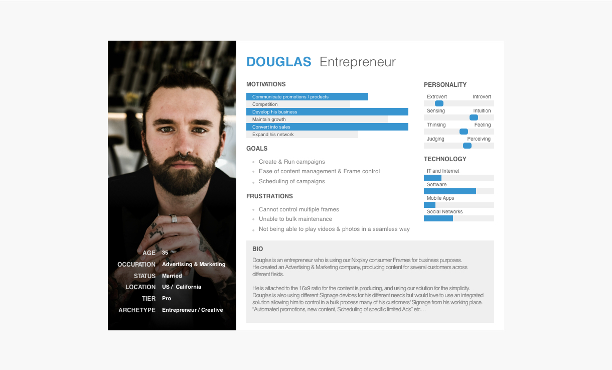
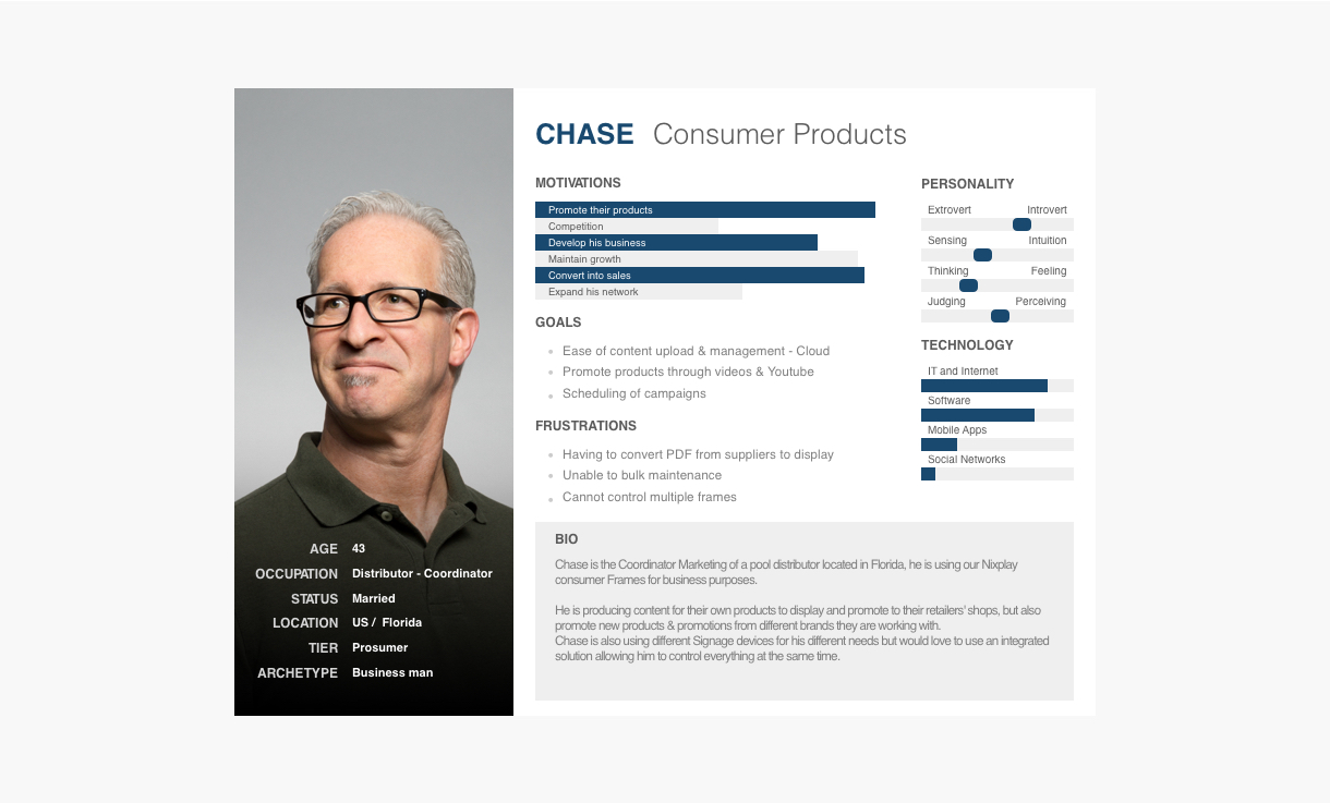
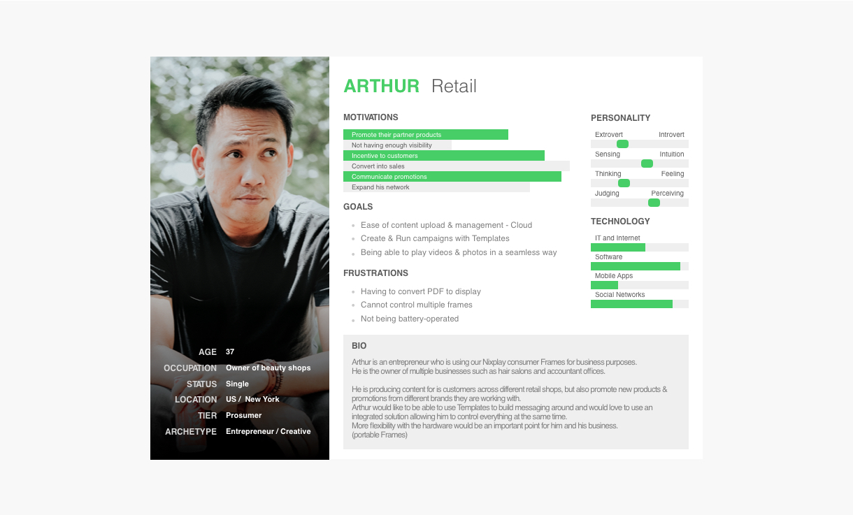
To illustrate the growing part of our users with an advanced need we used 5 different personas demonstrating the needs of each different industries, Hotel & Tourism, Retail, Financial services, consumer products, and Entrepreneur (covering a broad range of services like advertisement needs e.g. restaurant, events…).
At the end of a series of multiple interviews and by correlating with our competitive audits data, we resulted in a preliminary set of requirements. *Disclaimer all personas presented are based on existing users & interviews. Names and location have been changed for confidentiality purposes.
Take away: Almost all our interviewees possessed similar undergirding needs, regardless of their industries.
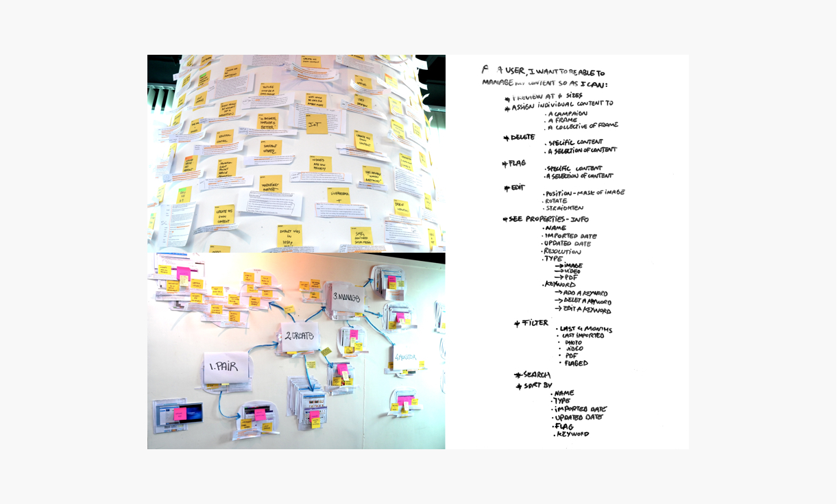
Some better understanding of our user pain points & behavior on the existing platform
Creating a mental model of typical user behavior based not only on assumptions but on collected data and research, helped us a lot to understand their current pain points and gave us some early hints on how and where to implement the new features needed.
Take away: This exercise helped us to identify where to implement more robust features for our users to achieve their goals.


User Scenarios
With our personas in hand, the data acquired from different artifacts we now were able to create some realistic scenarios of what users hoped to achieve with the new product.
Those were instrumental in pointing the limitations of our existing platform regarding a more advanced use, and helping us to point out where improvements were needed.
Take away: This exercise pointed us the limitations of our existing platform, specifically on the multiple management of Displays across different countries/Time Zones, the lack of remote feedback and control on the content.
Prioritization of features
Having agreed on what & where to start, we now were able to prioritize the way this MVP will be implemented.
The Blue projects were the MVP features we had to implement to provide a scalable platform.
The Green projects were the existing features we had to improve on
The Grey projects were the next in the pipeline features that we estimated essential to provide a solid Signage platform.

UX challenges
The firsts evident main challenges were to use the existent resources and engineering limitations from an old platform to build and sustain a much bigger new product. We had to focus on what was working well on our infrastructure to sublime it, and obviously fix what wasn’t optimal.
Also, we had to provide not only a totally new set of features for our existing users but also our potential new users – which included a large spectrum of B2b Signage users out there, from small shop & businesses to potential multi-million dollars companies. The scope for the Signage industry couldn’t be broader.
After that our research pointed out the main flaws of the existing platform regarding a B2b use of our products, e.g. multiple management of Displays across different locations/Time Zones, the lack of control on the content and remote feedback, no possibilities to schedule anything specific.
We came down to 4 main feature set on top of our existing capabilities, that would provide an MVP good enough to satisfy our existing users and potential new client that was interested in our solution.
- Multiple Display management & pairing (Grouping feature)
- Scheduling feature
- Protect Displays feature
- Dashboard Status Overview feature
User Flows & User journey
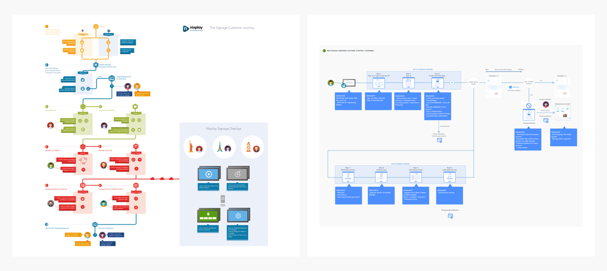
We started by defining what would be the global user journey for our Nixplay Signage users.
Then we shaped the different flows thru all the product.
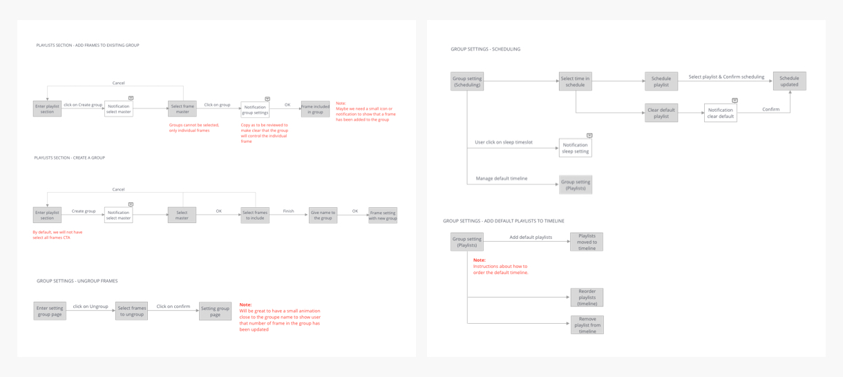
E.g.the pairing flow, which now had to be simplified to take into consideration the pairing of multiple displays, the Multiple Display management flow, media management flow, Scheduling flow, etc…
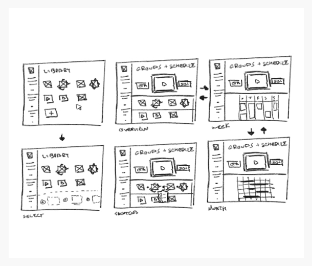
Features: Design Iterations to MVP
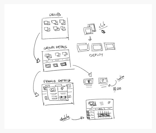
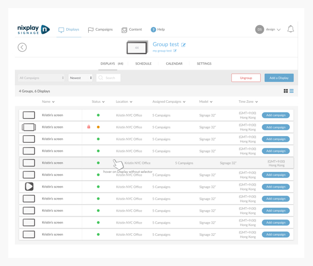
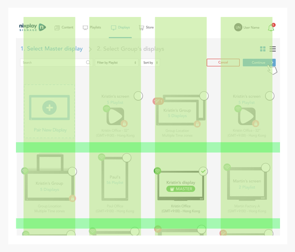
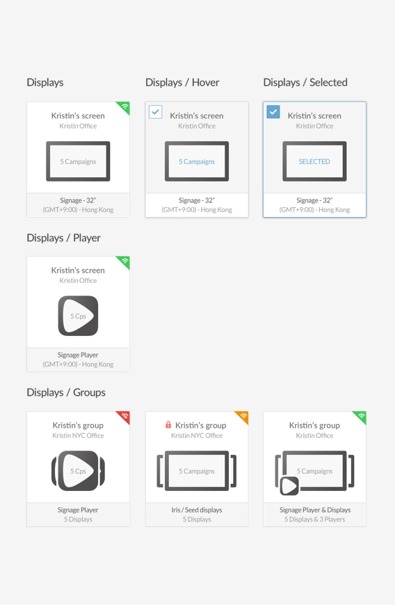
Grouping feature
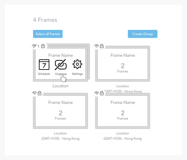
We kickstarted the features design work with the multiple Displays management “Grouping”. Simply put the Grouping feature is allowing the end user to handle multiple Displays acting like a single one. Which mean that all the potential settings, adjustment, and content would be identical and synchronized in the same Group.
Why a grouping feature?
As it stood out during our research majority of our users had a need for the easiest way to handle the Displays management in a bulk way, being able to easily send content to multiples Displays, locations and time zones. E.g. in the same location with a total of 6 Displays to group 2 Displays at a cashier running promotions and 4 other Displays in the store running different ads. Our users needed a powerful yet simple way to handle different use-cases. The best way to provide the tool they needed was to give them the ability to select any of their displays and arrange them to behave like a single unit.
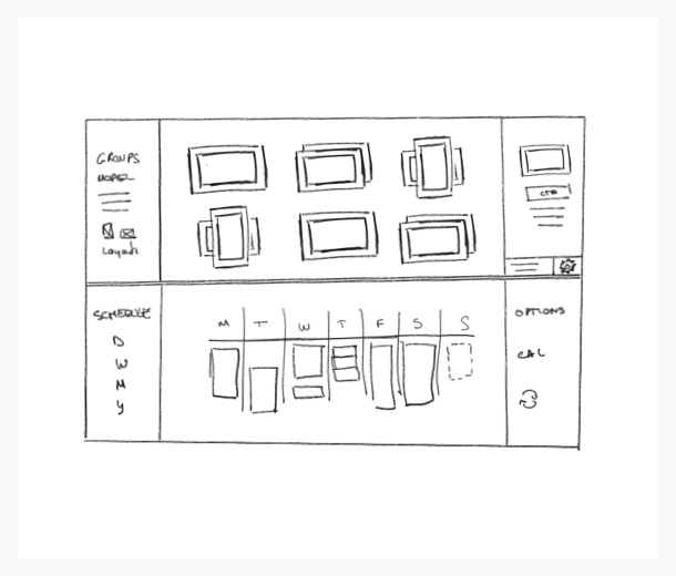
We first started with the idea of having a flexible Displays management page, allowing us to interact with the Displays individually and as a group but also to interact with their content/campaigns at the same place, also integrating a schedule component to it. This was our end goal vision for this new displays management tool.
With this in mind, we focused first on how to physically manage the Displays in a bulk way, which was the #1 priority for our users. This came with quite a few challenges that we didn’t see beforehand. We quickly realized after the first iterations that grouping displays also meant having to deal with things like Timezones, motion sensor settings, programmed sleep schedules and content display preferences like ratio, fit to screen, pan, etc… that were inherent to every single unit.
To overcome and simplify this problem of having potentially dozens of different configurations being merge and control at the same time, which would have definitely caused problems like content displaying issues E.g. images/campaigns being displayed in a different way on screens inside the same group.
We took a different approach by choosing a Master Display to rule them all. One of the big advantages of this solution was that the users would not have to do or redo any settings, but just to choose wisely their first Display (or just start a new group from scratch). Once chosen all the inherent settings to this Display would be cloned to the group to act together as one single Display.
To achieve this we iterated and tested a few drafts were users had to choose between the list of all the Displays the ones with the preferred settings. We realized that even though the learning curve was slightly steeper with this Master solution, the overall flow and simplicity were significant. Users reacted better if they knew in advance what to deal with, in that case picking their desired display as Master first and then just selecting the following Displays without thinking twice, rather than selecting a bunch of units and then being presented a listing with lots of information about the selected Displays and having to pick one configuration to apply to a group.
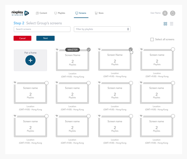
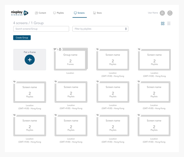

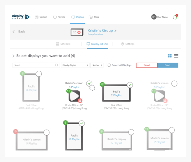
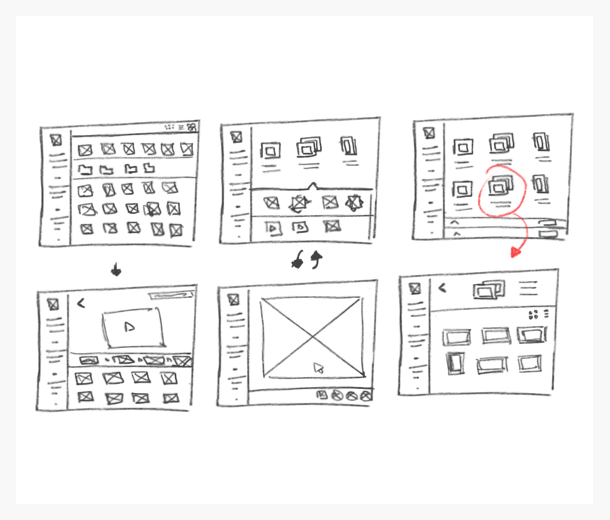
Finally, on the visual layout, we opted for a stacking representation with the ability to physically interact and open those groups, being presented with the units belonging to a group on another level of visualization helped on the overall simplicity.

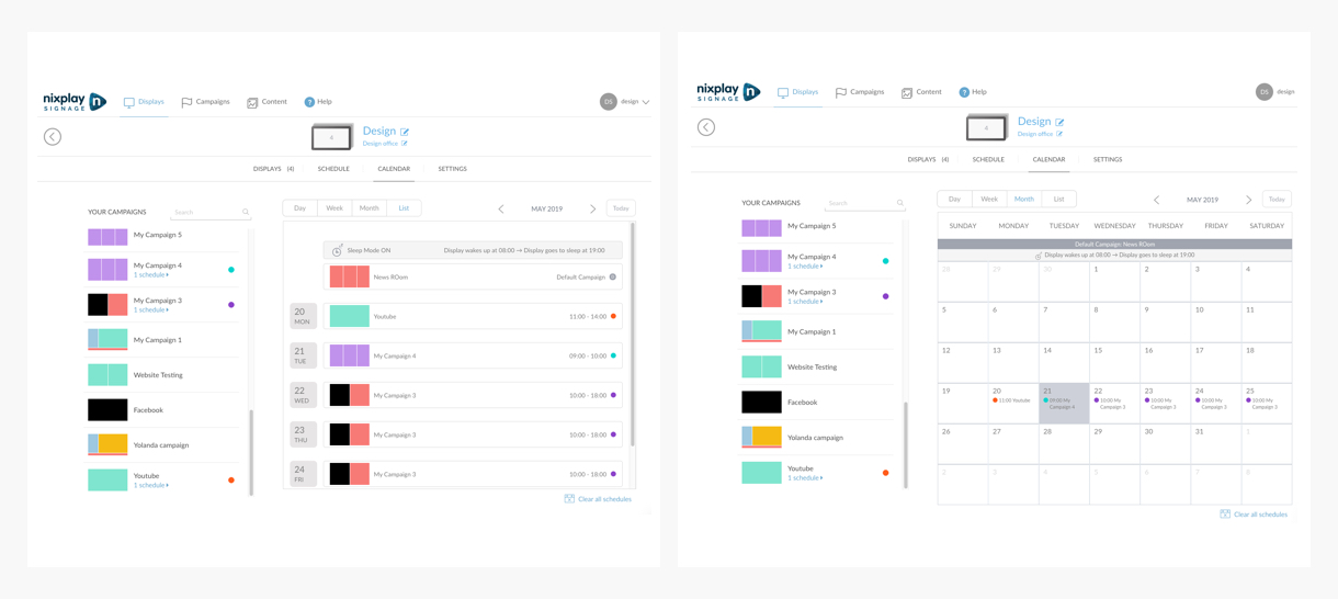
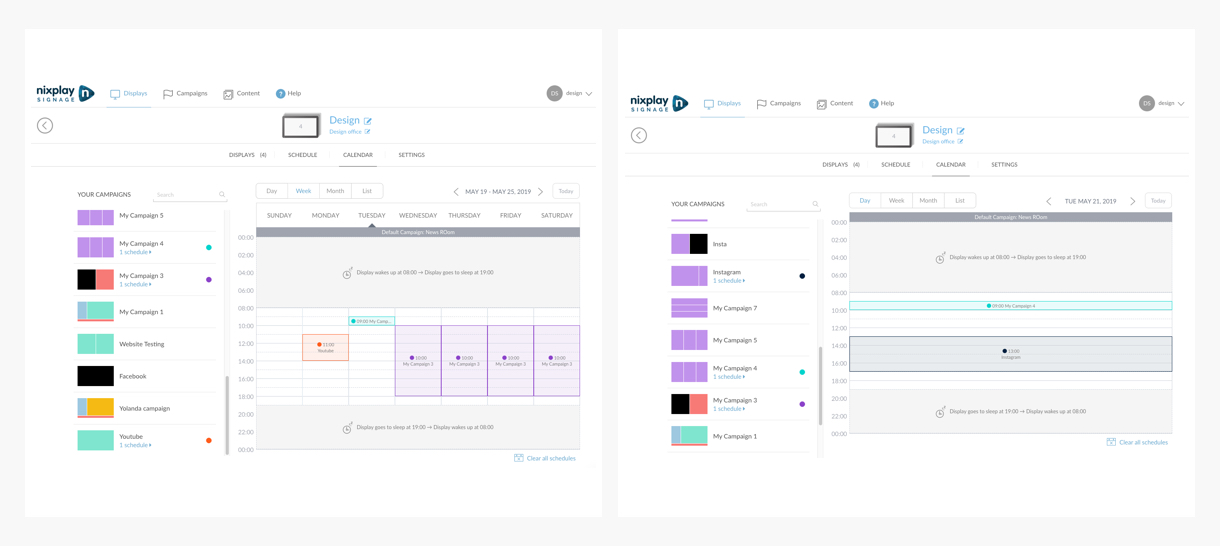
Scheduling feature
Coming hand to hand with the grouping feature, was the need to schedule precisely component on a timeline. Being able to schedule a specific playlist of a predefined time during a timeslot or being repeated during a specified period. Which is also allowing the user to set different future events on a calendar view.
Why a scheduling feature?
Resulting from the insights given from our research, we realized that our users needed the easiest way to handle what was displayed and where with a grouping feature but also strongly needed the ability to control when this content would be played. E.g. in our store of earlier being able to set specified promotions for the morning and the afternoon at the cashier, and plan other ones at different times in the rest of the shop.
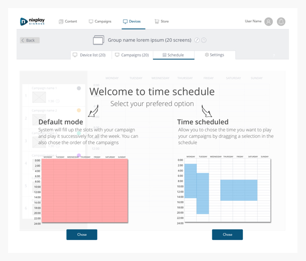
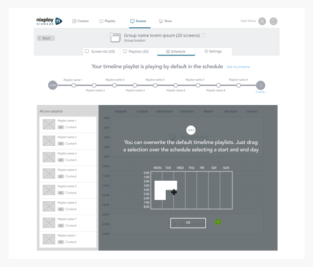
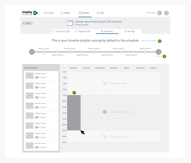
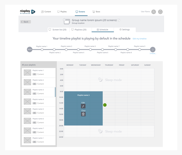
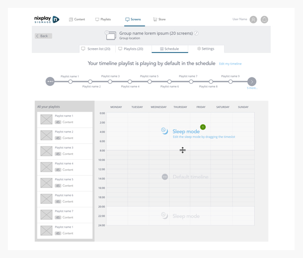
We first started with the same coherent idea of having the schedule modules inside the Displays management page, and more accurately inside the Displays themselves. Many options and directions were possible at this point, but opting for the scheduling part to be inherent to the Displays, or group of Displays was more consistent with our new proposed experience and was the best strategic way to implement it with our infrastructure.
Always having simplicity in mind we tried to reduce as much as possible the frictions for our users using this scheduling feature. A lot of iterations and testings were necessary to propose a final viable version, we had to take in consideration one of the main feature from our b2c product that our users liked the most, being able to simply assign a component (in this case a Playlist) to a Display and not having to bother with scheduling and timeslot, just knowing that the content will be played following the order of the assigned playlists.
We were now facing one of our biggest challenges, having in the same hand users with advanced needs wanting to schedule and control precisely their content, and users wanting to use our solution for its simplicity. Our solution to this problem was to introduce a similar function like assign & play, on top of the rather standard schedule system.
This feature took place under the default schedule name, on top of being able to precisely choose each component (Playlist, Campaigns, content, etc…) and to build a precise schedule. We allowed users to quickly and simply choose a single component and attribute it a default status, which would act as an overlay and override the existing schedule in place for a non-limited amount of time, without obviously impacting the schedule already in place after deactivation.
With this feature, users were able to easily switch between complex time managed schedule, and always playing content without having to think about intricate planning in a rather simple way by literally pushing a toggle.
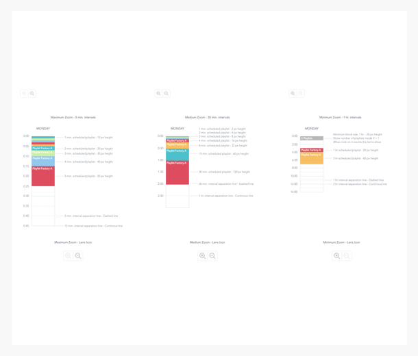
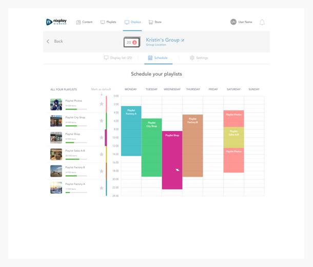
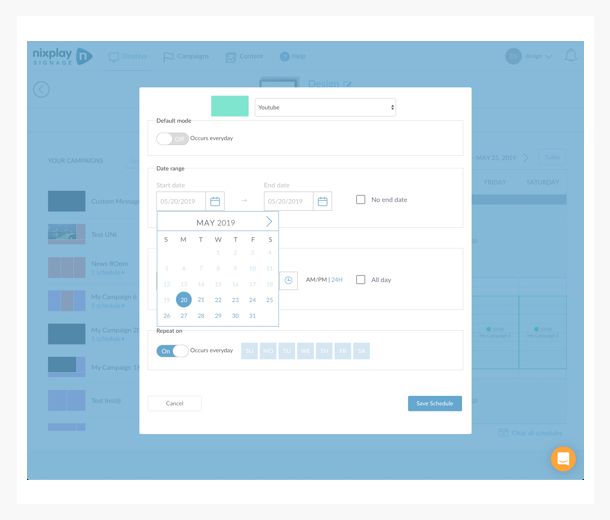
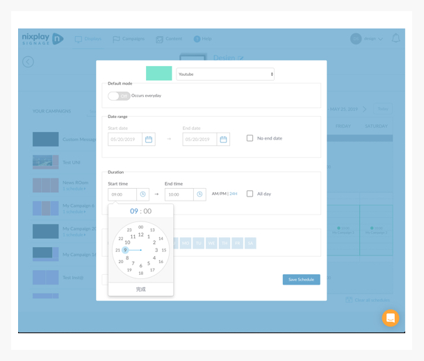
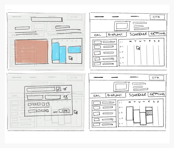
Finally, one last technical aspect we had to take in consideration was our schedule layout because our users had different needs regarding their scheduling. Some heavy users would like to easily toggle between a monthly view and a week view to have an overarching view of their planning when others would prefer simply a list view telling them the next playing assets. We had to fine-tune the visual layout and representation to suit all the needs.
Protect feature
Followed by the protect feature, which allowed the user to lock or unlock their Displays or group of DIsplays remotely to avoid any malfunction or physical interactions with them, which could have an impact on their advertisements.
Why a protect feature?
This is a feature that originated itself from the hardware we were developing for our new Signage ligne. As the company provided remote controls with each unit to have the ability to control them not only remotely from their account but also physically (on-site), which provided a much more granular control on their Signage Displays.
E.g. A head office of multiple factories can set up different playlists running on a different group of Displays and decide which group/Displays will be locked or not. The Administrator will then be able to have granular control on his Signage Displays and give precise access to his staff on the field on who & when can have the control of the content playing.
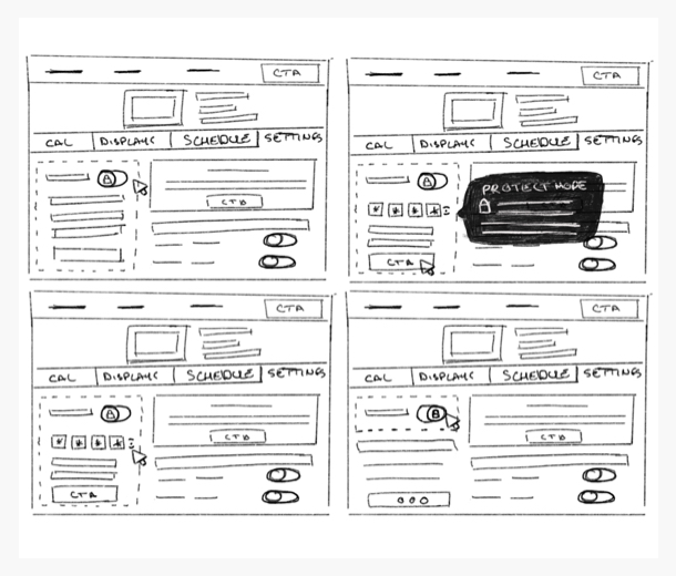
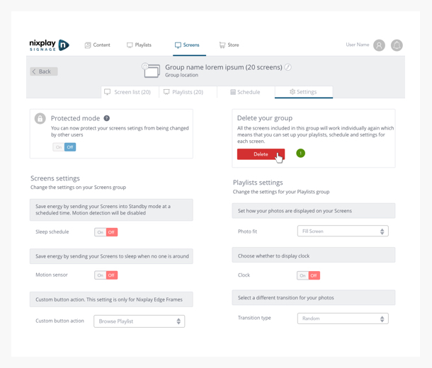
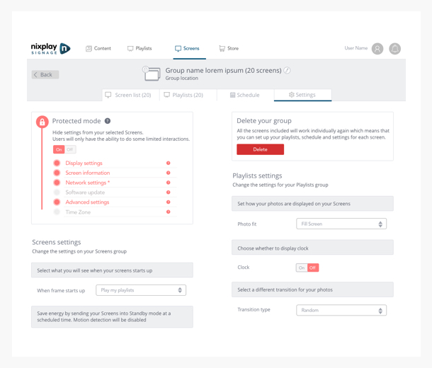
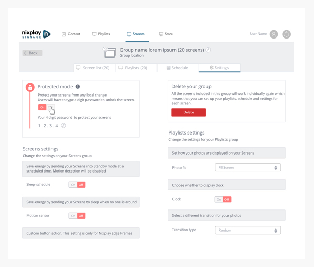
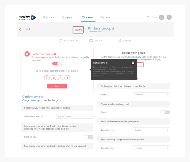
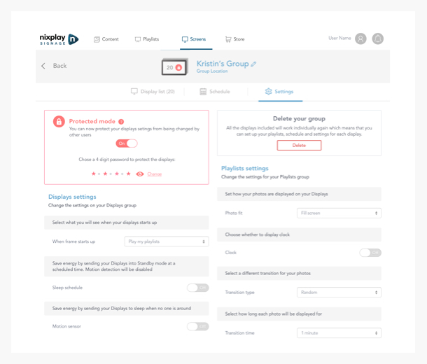
The basic idea here was simple, being able to physically lock Displays remotely. As always the execution was not as easy, we figured out after the first drafts that simply locking a Display wasn’t good enough. As every single unit of our Displays, groups or not, had the capability of being physically controlled by a remote. This came with a lot of different use cases to tackle, E.g. what about a shop with all of his Displays being part of a Group or multiple groups, and we suddenly have a video playing with a noisy sound in the background at the wrong moment.
This Protect feature had to be a subtle mix of granular control and simple & easy enough to be useful and be recognizable. We had to make it visually obvious from the software side (on the Displays list) but also on the physical environment (on the Displays themselves) when interaction was made with the displays to quickly understand what was locked and what wasn’t, to react to it in the physical world and to easily locate or filter the Locked unit on the software management side.
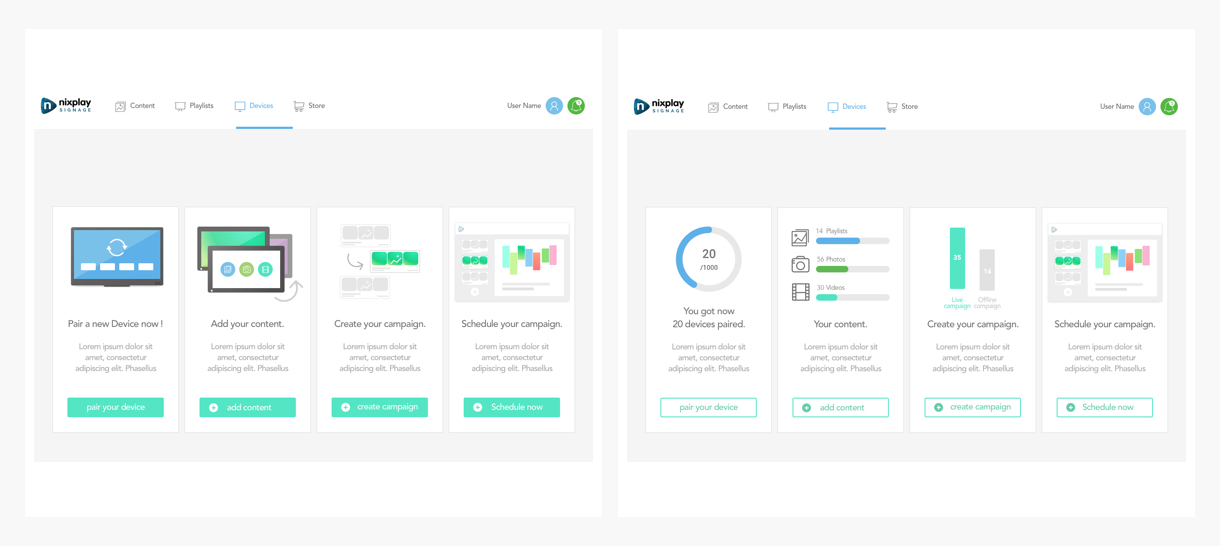
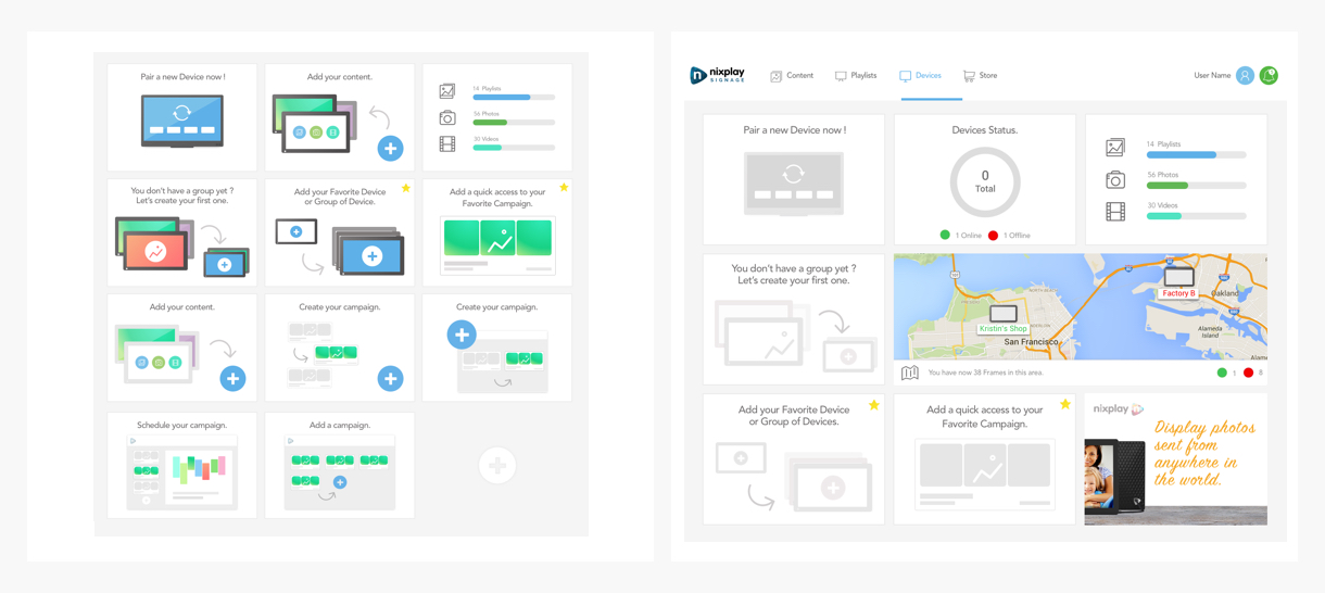
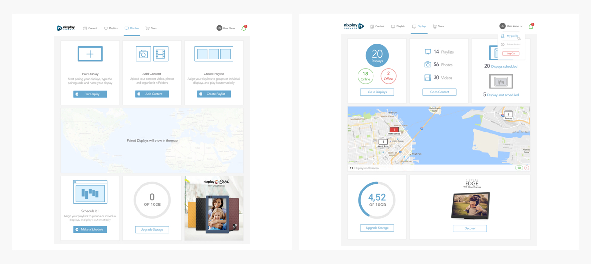
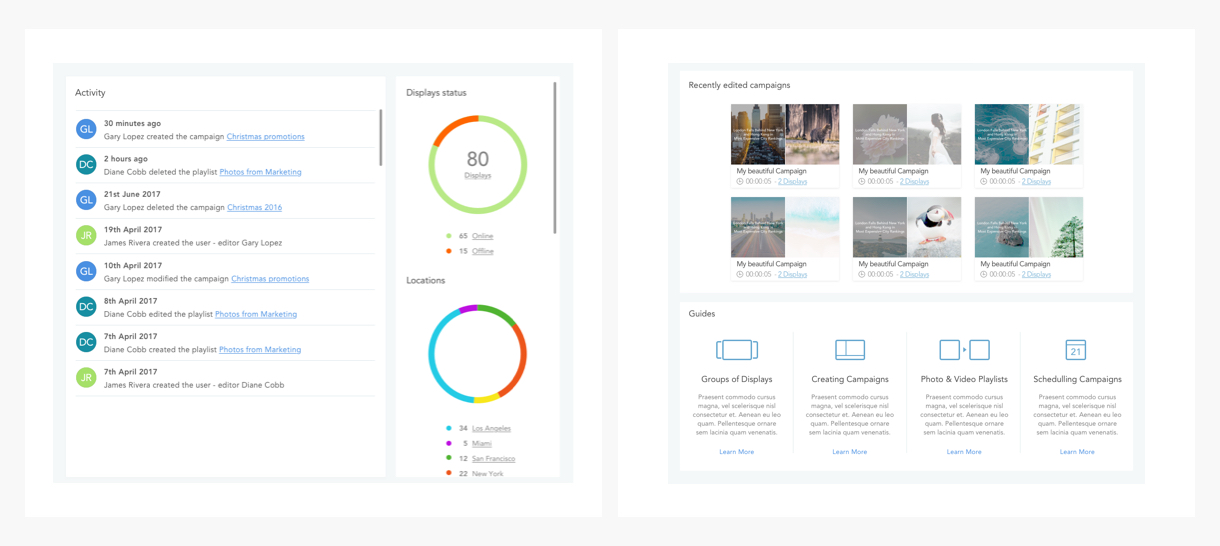
Dashboard feature
The Dashboard feature is the entry point of the product where the user can have a quick summary/monitoring status of what is happening on his platform. An administrator would be able to spot at first sight if there is any malfunctions or Offline DIsplays on their fleet, but also have a general idea of how many campaigns and content are scheduled & running.
Why a dashboard feature?
This was requested as a minimum viable feature by our users, and we thought that it could be also the ideal place in the next iterations to display the impressions of different campaigns, even compare the different impressions data, coming schedule campaigns, etc…
Being able at first sight to see the impact of a campaign or see how things are performing vs others on end users, could be a game changer for a company with Signage needs.
Regarding the implementation of the Dashboard many iterations and testing were involved, we knew we wanted to use a card layout, at first we tried an onboarding approach that transformed to monitoring cards once the essential steps were reached. Then those designs evolved into a more live monitoring aspect, as our users wanted the ability to have an overview of what was in place and running at a glance. Iterations were proposed with activity feeds updating users in real time about what and where things were displayed, and a section with the most performing campaigns was also pushed, thereby the ability to pinpoint on a map where those units where performing.
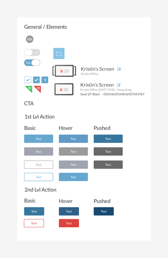
Implementing a Design System
After having built these main features for the MVP we implemented them thru a Design System to ensure the maximum of consistency in the design patterns, but also in the communications between all departments.
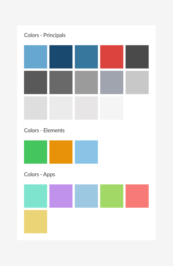
How did we manage our visual assets & pattern?
First of all, we started by organizing our assets in the design department to be able to stay synchronize between designers and ensure consistency through the patterns put in place. We used Sketch libraries at first to achieve this goal and being able to design screens dynamically.
We build our Design System based on Atomic design with a structure looking like:
- Colors
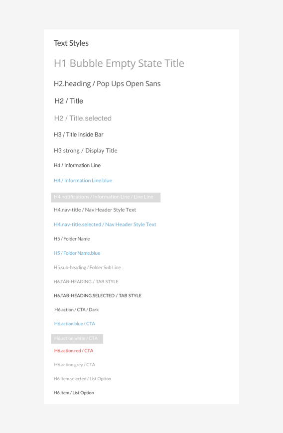
- Text Styles
- Icons
- Pattern
- Components
- Templates
We then use UXPin to translate our Sketch Libraries which now formed our Design System. With this tool, we were able to put online the Design system and add the level of interaction needed.
This was of great help to deliver to engineers a comprehensive design that they were able to comprehend in their language, as they were able to directly associate the building blocks of code with each element and animations.
After multiples iterations, Alpha & Beta testings with our end users, our brand new product was now ready for our public release and we were excited about it!
UX solutions
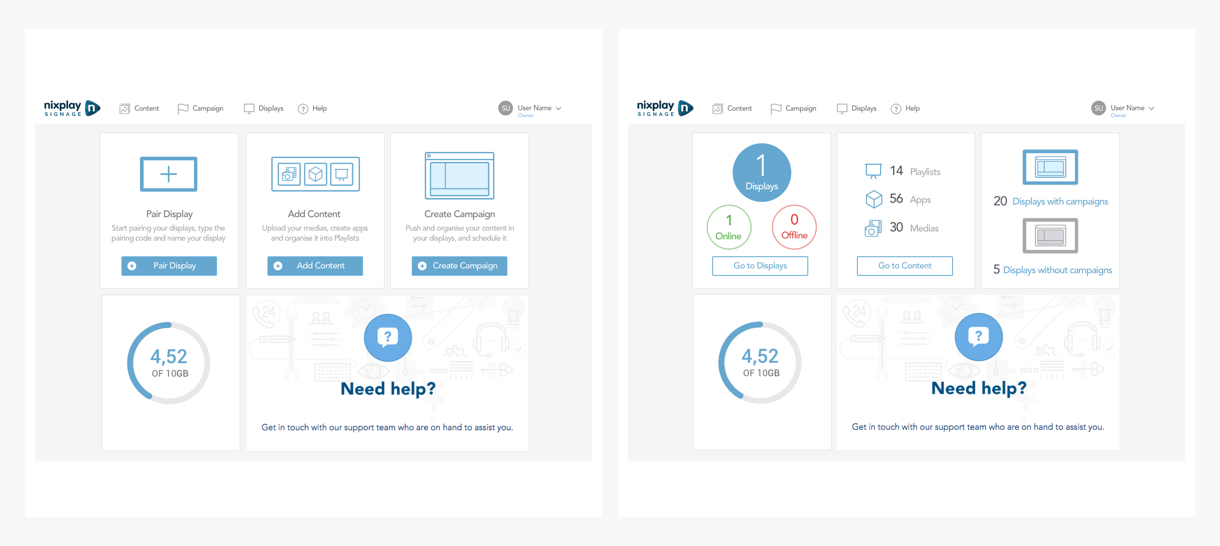
A simple out of the box signage solution, offering easy but yet powerful media management, scheduling, and fully secure multiple Displays management.
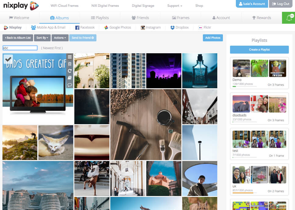
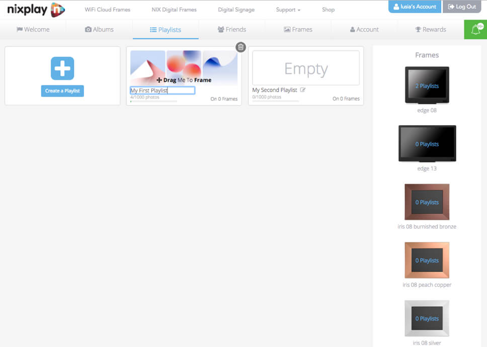
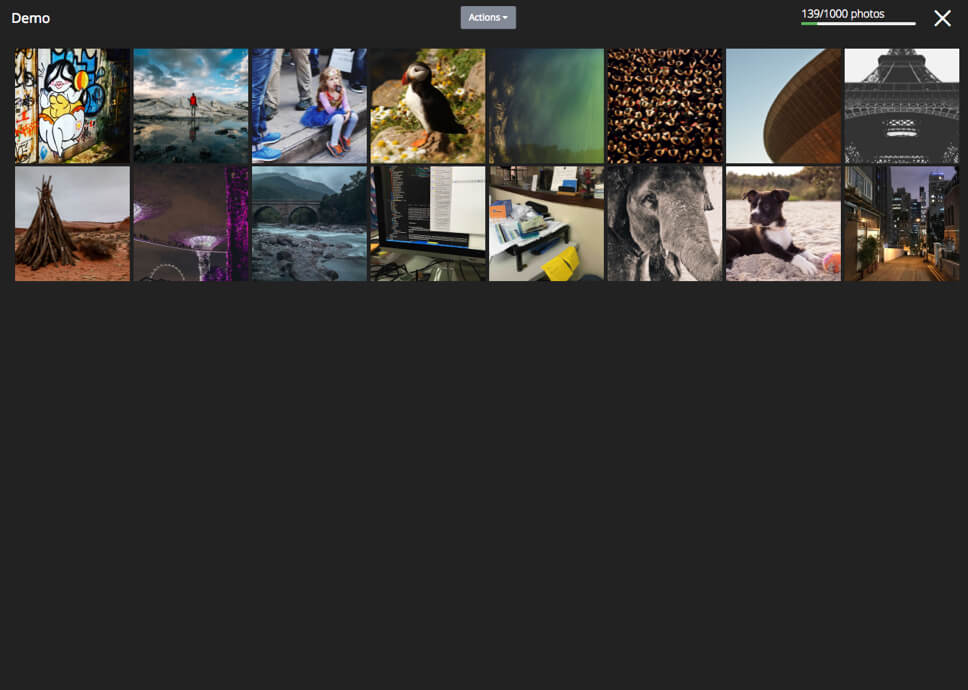
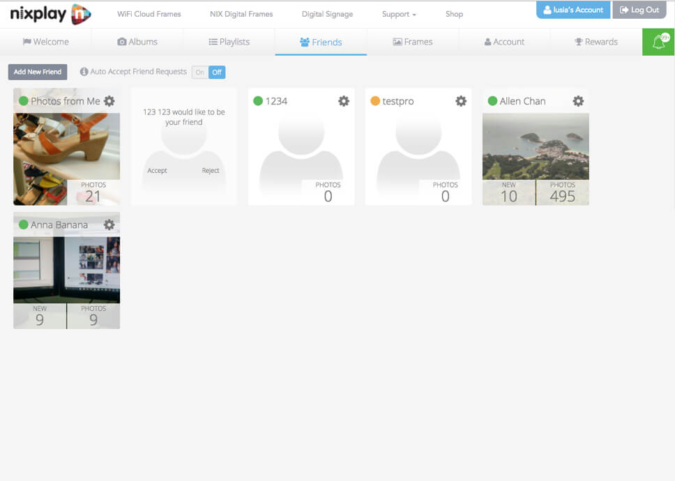
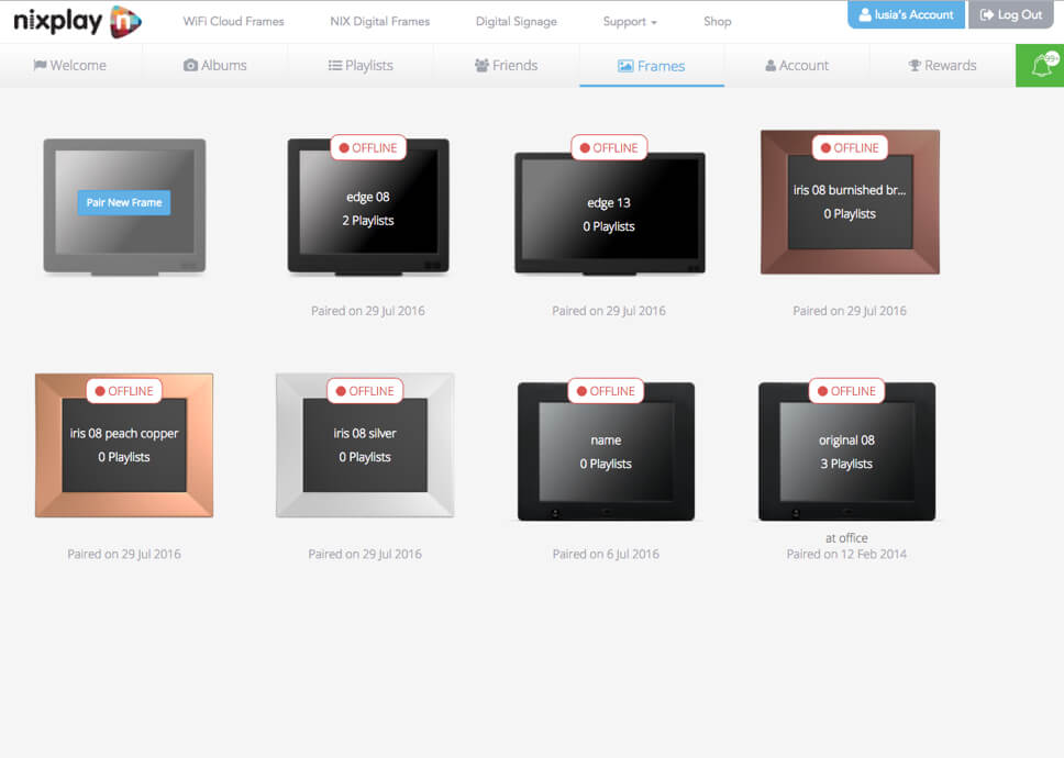
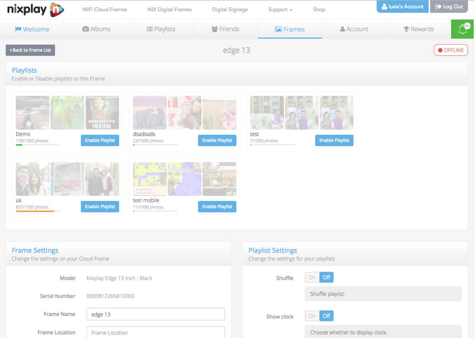
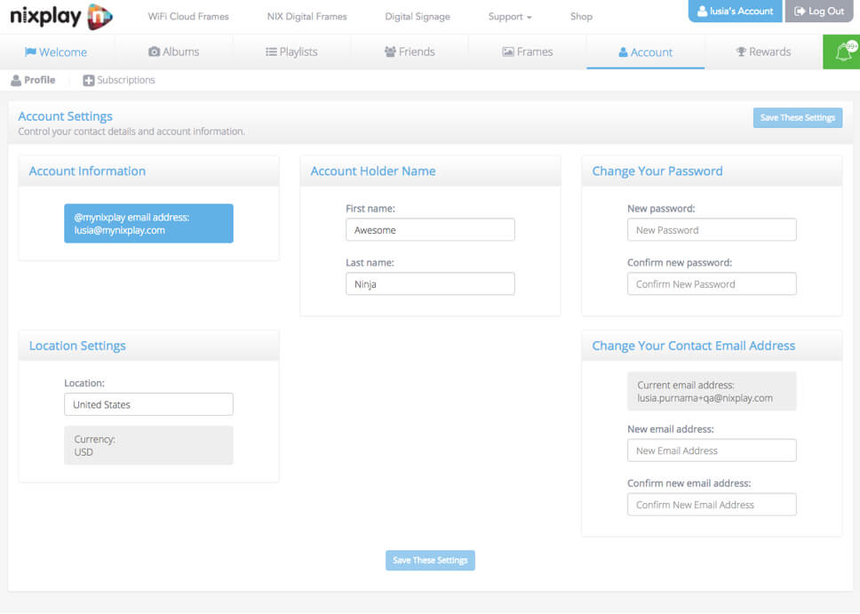
As we kept the existing infrastructure as a base for this new product, this gave us a proven solid environment to support future enhancement. We then started not with a blank slate but with media management support (including social media), Albums, Playlists, account settings, Frames settings, the same proven Cloud technology improved with better latency and charge support.
Regarding our targeted customers we had to focus on the small companies, for this MVP release but we already planned broader spectrum with the implementations of advanced features on a tight schedule following the initial public release.
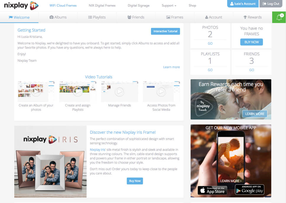
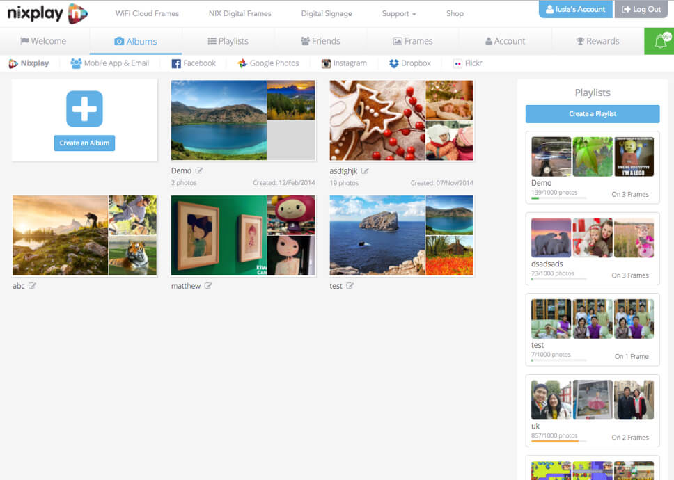
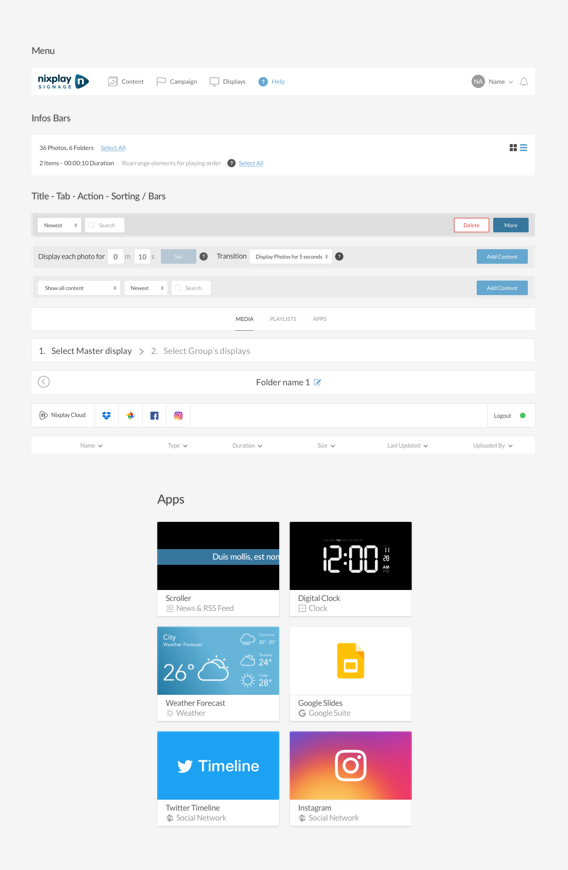
Here is a look at our MVP.
The measurable impact
Shortly after public launch in January 2017, we accumulated thousands of users, more than 1028 unique user account on the platform, besides this wasn’t a unique delivery but only the release of a Minimum Viable Product which was followed by several new features and updates with less than 1 month after this initial launch for the first iterations.
+200
Companies trusted us
for their Signage needs.
+1k
Of Nixplay Signage Displays
sold.
20%
Of new users joining
our services after 6 months.
200
Some clients using up to
200 Displays spread in
multiple locations &
Time zones.
+1M
More than 1 million playlists displayed.
What’s next?
We continually optimized, improved, iterated and added new features to the platform since the original well-received release.
Shortly after the MVP followed major upgrades like Apps, Campaigns (Multi Layouts, Timeline), Multiple users (ACL), Advance Playlists, Advanced Schedule, Proof Of Play.
We now reached all the necessary milestones to become a solid player on the Digital Signage industry and we are striving to stay focus on our end users and their needs to keep delivering the best possible experience.
What it looks like


