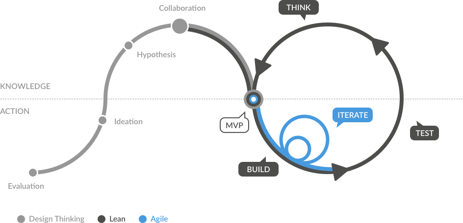
Here is a look to my UX Process
What is a Ux Designer role?
UX designers are great analysts, they question everything. They’re aware of biases, and they validate assumptions by triangulating quantitative and qualitative data. They think in terms of screens and systems.
A quick overview of my Ux process in an Agile environment, here are some of the tools I use every day to build the products that customers needs, several methodologies convergent all to the same goal, delivering a user-centered product.
Phases & Deliverables
Think
Research, Analysis, and Strategy
- Quantitative & Qualitative
- Competitive Audit
- Stakeholders interviews
- User interviews
- User surveys
- Red route Analysis
- Mental Model
- Analytic review
- Card sorting
- Kpi definition
- Affinity diagram
- Content strategy
- Collaborative Brainstorming
- Customer journey maps
- User personas
- User scenarios
Build
Design, Implementation
- Collaborative Design
- Sitemaps I.A
- Taxonomy
- User Flows
- Sketches
- Wireframes
- Paper prototypes
- Lo-fi prototypes
- Hi-fi prototypes
- Mockups
- Development
- QA Testing
- Alpha & Beta releases
Test
Analytics, Optimization & Iteration
- Analytics review
- KPI performances
- Heat mapping
- Usability reports
- User tasks & testing
- Usability test plans & scripts
- Quantitative & Qualitative feedbacks
- Bug fixes
- Improvement
Think
Research, Analysis, and Strategy
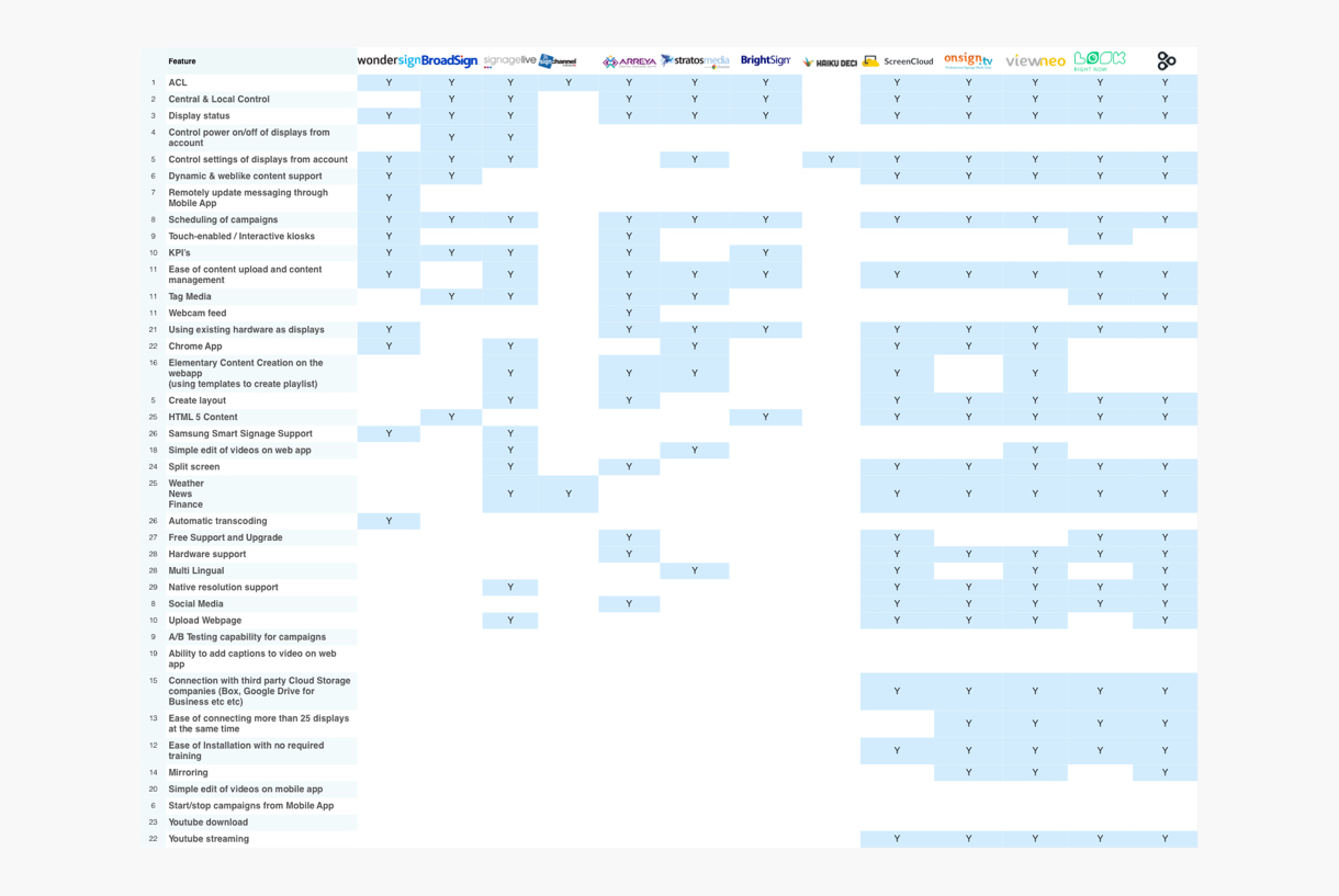
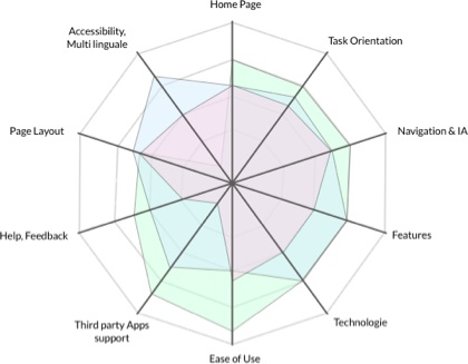
Competitive Audit
Examine the strengths and weaknesses of your competitors using an overlaid heuristics diagram. Evaluate areas such as ease of form completion, clarity of navigation, accessibility, trust factors, features list etc…
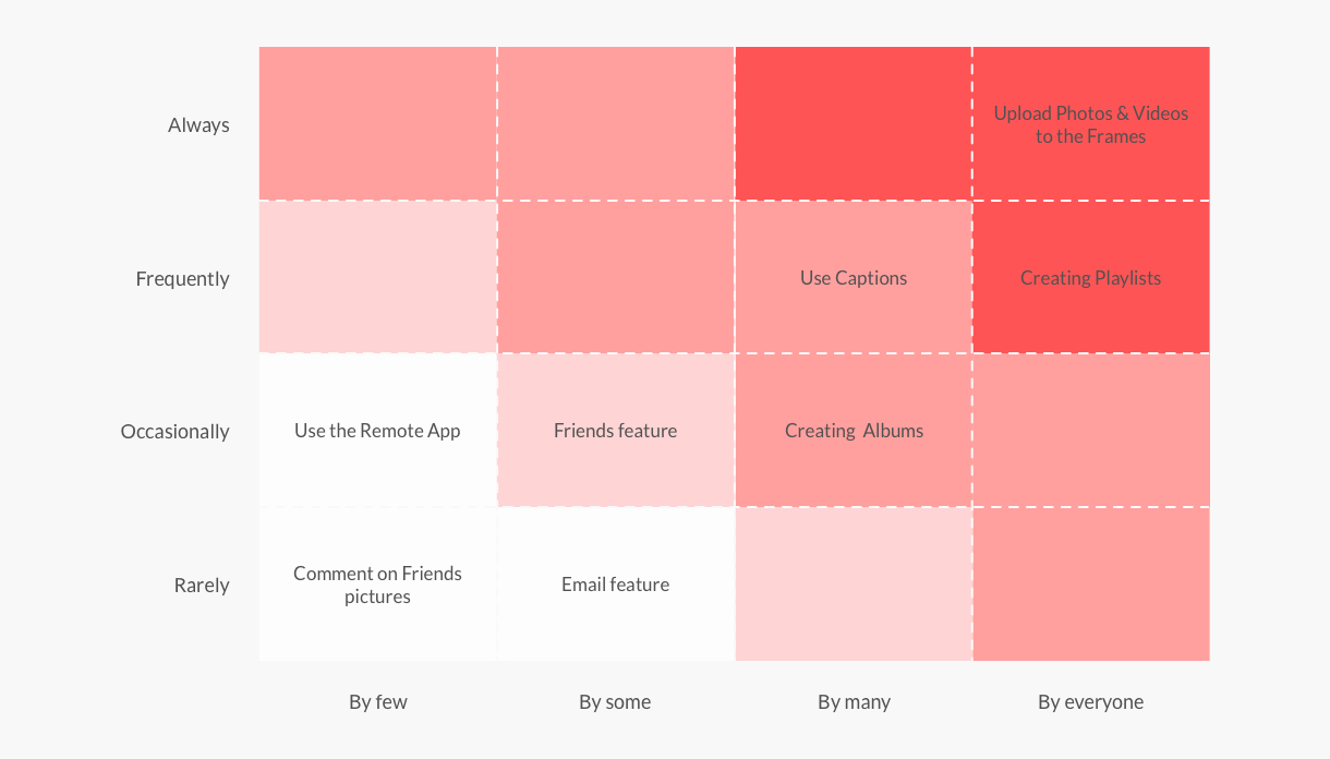
Red Route
Analysis
Red routes are the critical tasks that deliver the most value to your users. These routes are the foundational user journeys that make your product value and typically capture 90% or more of your user’s actions. Identifying red routes helps your team prioritize user needs and facilitate alignment amongst your stakeholders. It also helps your team build and optimize product features that deliver the most value to your customers and drive your key metrics.
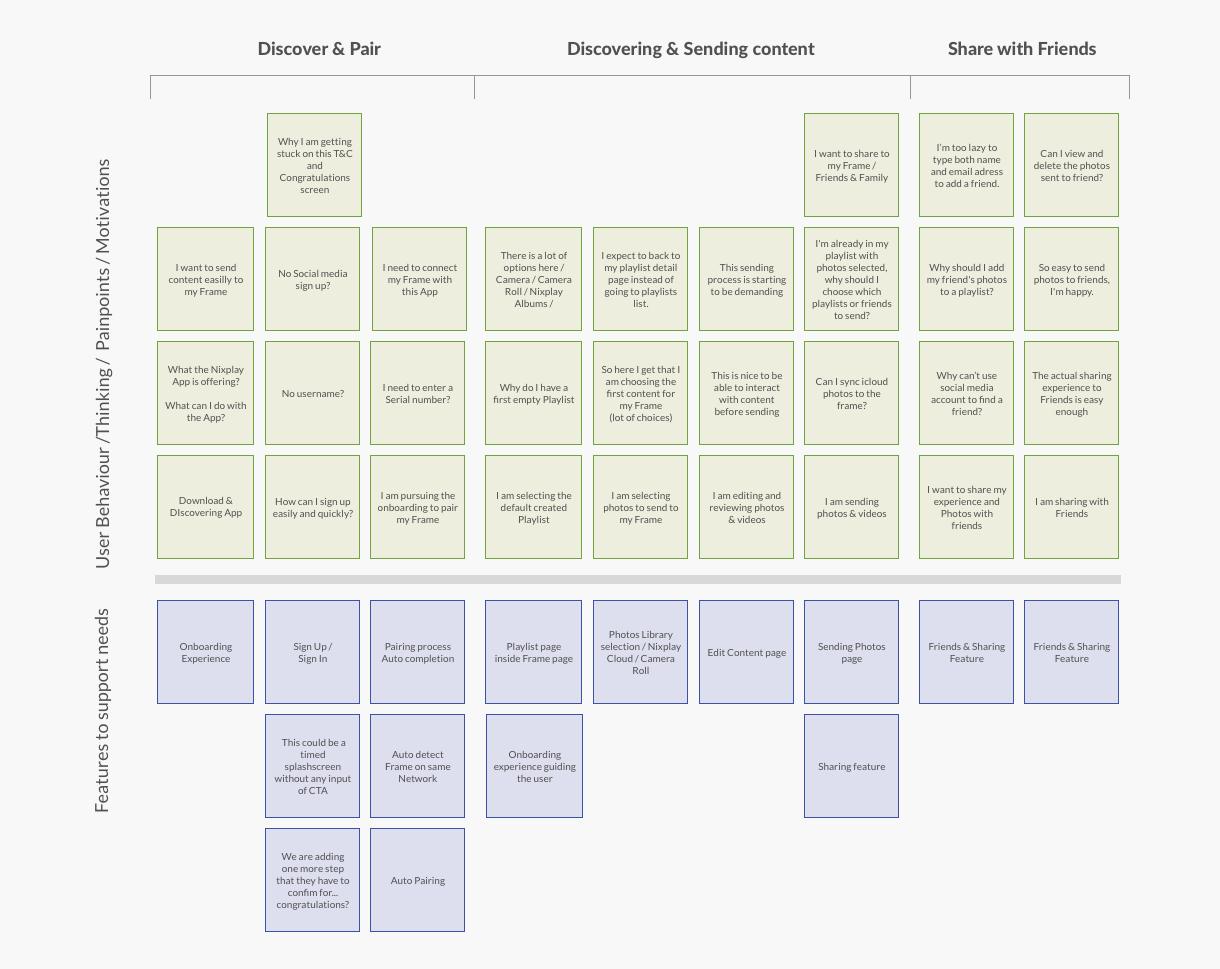
Mental Model
Analyzing user behavior, pain points, motivations, and needs from contextual inquiries. Group into logical columns. Map out product features for each column to identify gaps, opportunities, and feature improvements.
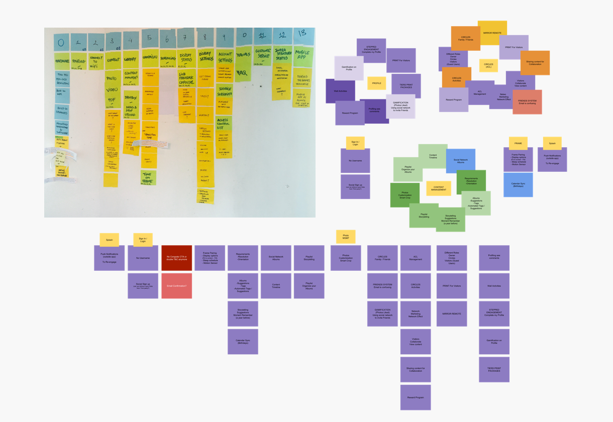
Affinity Diagram
This is a method to visually organize ideas and find cohesion in the team’s concepts. Affinity diagramming helps us shift from casting a wide net in exploring many possibilities, to gaining focus on the right solutions for this audience. All team members should put their ideas generated in the lensed brainstorming activity up on the wall. Have someone sort the ideas into categories and label them. As a group, begin to consider where you might combine, refine, and remove ideas to form a cohesive vision of the future customer experience.
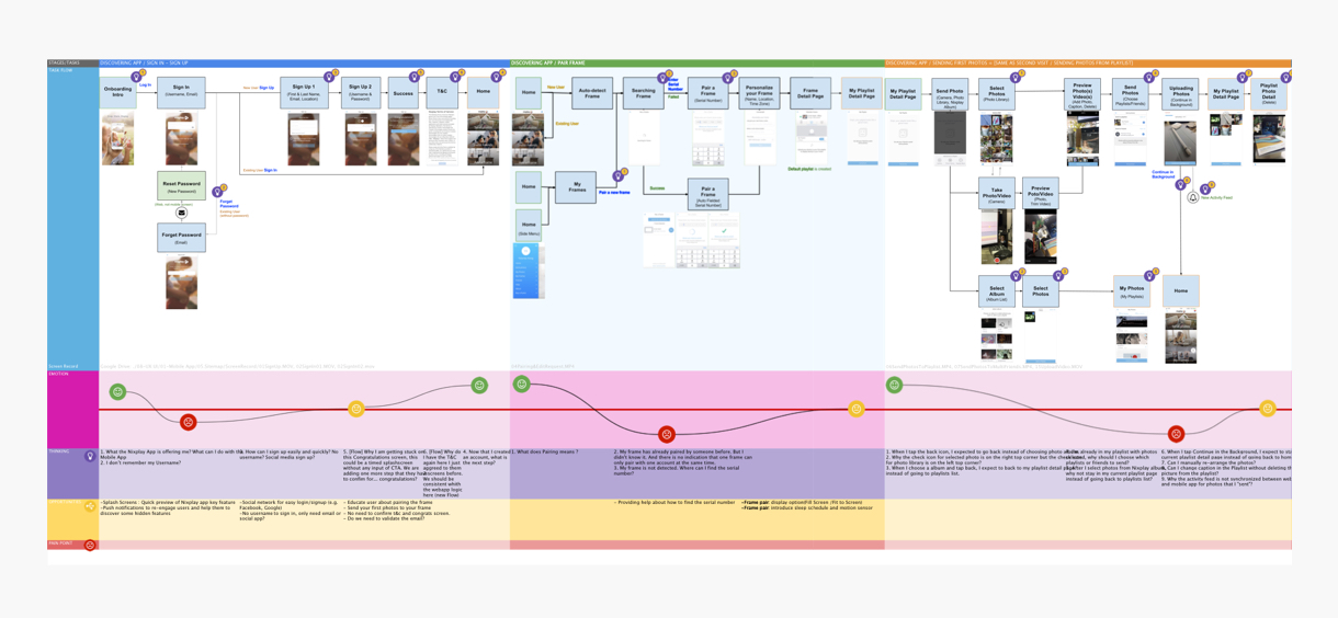
Customer Journey
Map
The ultimate document for understanding your user, journey map out the personas and user scenarios at each step of the experience. User emotions, quality of experience, product weaknesses, and other factors can all be documented. Moreover, they generally cover users touchpoints before, during, and after service so you can gauge the lasting effect of your design.
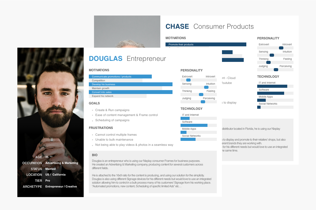
User Persona
Once you have adequate data on your users, you can build user personas. These act as stand-ins for the actual user during the design process, focusing more on behaviors and demographics.
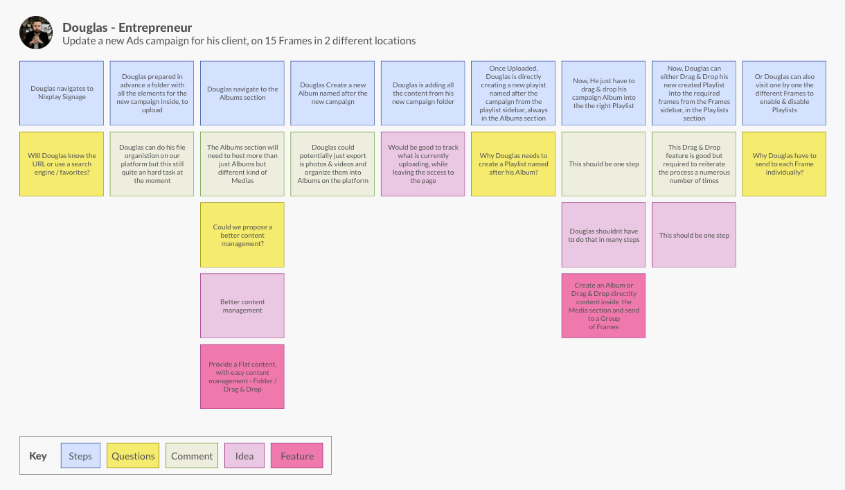
User Scenario
These logic exercises take personas a step further they generally outline how a persona would act in a specific situation, including what pages they visit/actions they do and why. We even included here questions/comments/ideas & analysis from the Ux team directly on important steps or pain points.
Build
Design, Implementation
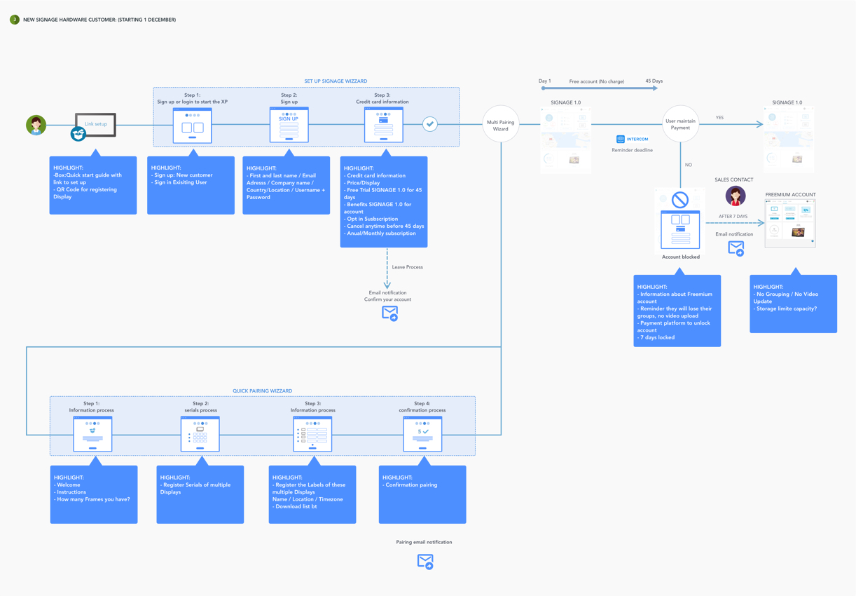
User Flows
Once you’ve done enough user research, you can start outlining what & how the pages in your design correspond with user actions. User flows help you improve the efficiency of your design. You can evaluate the amount of friction at each step and minimize steps when possible.
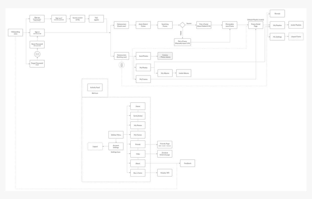
AI/Sitemaps
Architecture Information/Sitemaps depict all the pages (or other defined elements) of a product and how they interconnect, typically in a simple line drawing a diagram. You can even connect the “forest” view of sitemaps with the “tree” view of wireframes and prototypes by creating an interactive sitemap.
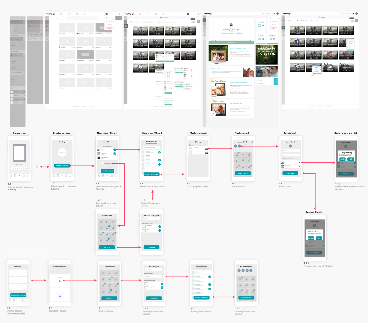
Wireframes/Lo-Fi
Wireframes are the barebone structures of your product, dedicating time to building one allows you to flesh out your sitemap without more complex details distracting you. It’s also presenting several advantages, they are the perfect tool to do early testings, they put less pressure on the users, stakeholders recognize that the work isn’t done yet and can be more objective, everyone including the early users feel less wedded by those early drafts and will feel more inclined to expose new ideas and comments.
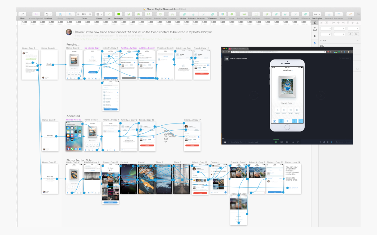
Hi-Fi Prototypes
The last iterations of your product before the live version. Hi-fi prototypes are ideal for fine-tuning the interaction design and animations. Those usually can be used as early testing materials.
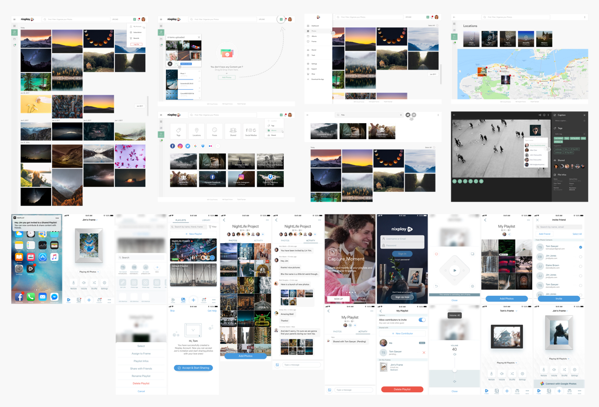
Mockups
These allow you to focus solely on the visual details of your product, creating a hi-fidelity reference for how it should look. The last iterations of your product before the live version. This is also the visual reference that will be used for the design system library.
Test
Analytics, Optimization & Iteration
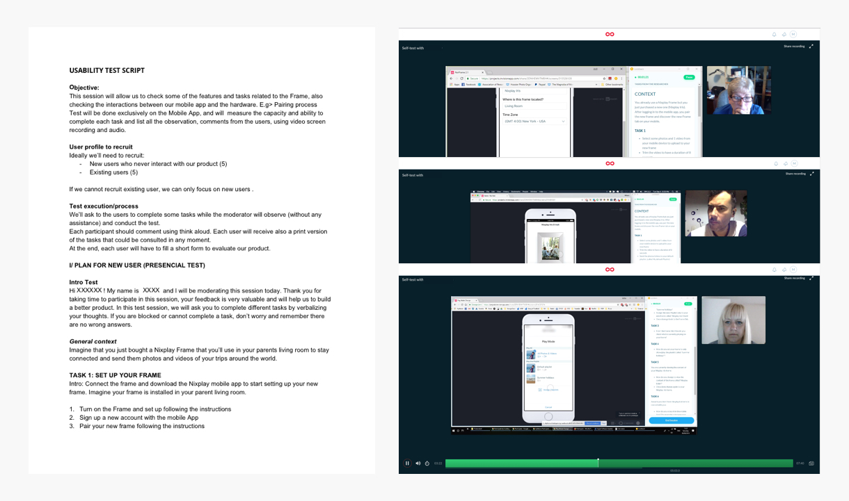
User Testing
This is the strongest influence on design decisions. It helps ensure you aren’t forcing users into unnatural paths of behavior, and also counterbalance stakeholder feedback. “Don’t think this stage must only come after the designing phase. Testing should occur early and often, it should happen alongside the design process at different intervals so that the results can be integrated into further designs.”
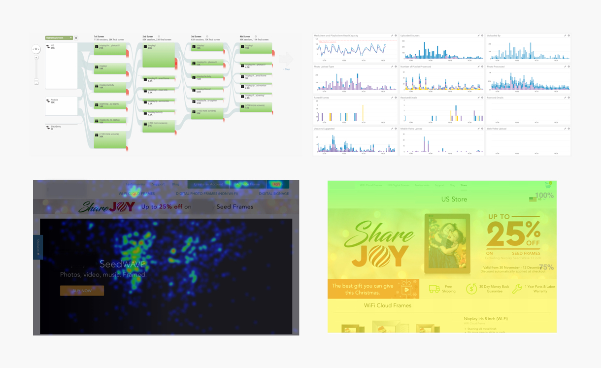
Analytics/Heat Map
These metrics are essential to measuring the achievements of your designs but also to analyze different user behaviors and paths to better understand them. With this information, you can draw logical conclusions about how your users are interacting with your products, and if the delivered designs are fulfilling their needs.
